 MegaMegaTypeType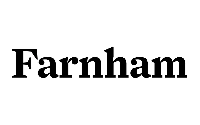
A Fleischmann-inspired transitional serif by Christian Schwartz, revived and remastered with Bea Korsh to include swash capitals across a full range of italic weights, split into Display and Text optical families.
About
Farnham takes its cues from Johannes Fleischmann, the German-born punchcutter who worked at the Enschedé Foundry in Haarlem and was celebrated for the angular vivacity of his letterforms. Christian Schwartz carried Fleischmann's characteristic exuberance through all weights of the series, with the family later updated alongside Bea Korsh to meet contemporary typesetting demands. The result spans two optical subfamilies, Display and Text, with swash capitals extending across the full italic range.
Classification
Farnham draws from the work of Johannes Fleischmann, an 18th-century punchcutter whose letterforms sit within the transitional period between old-style and modern serifs, characterised by high contrast, sharp serifs and pronounced angularity.