 MegaMegaTypeType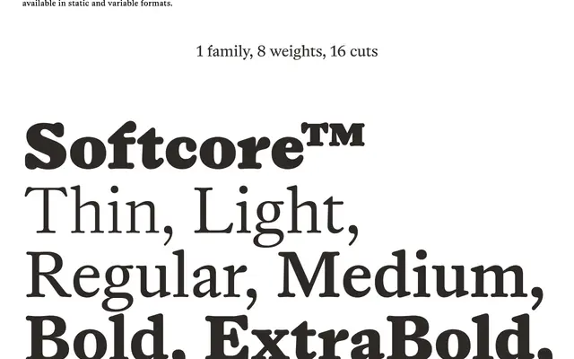
A warm transitional serif spanning eight weights with italics, drawing on J.M. Fleischmann's 18th-century German-Dutch punchcutting tradition while softening its forms through rounded, felt-tip marker sketches.
About
The design balances a historically grounded construction with a contemporary softness: precise digital outlines retain the contrast and axis of Fleischmann's work, while rounded stroke endings evoke the spread of ink on paper. The family is optimised across a range of sizes, performing in display settings and maintaining legibility and texture in smaller text. Static and variable formats are available across all eight weights and their matching italics.
Classification
Rooted in 18th-century German-Dutch typography and inspired by J.M. Fleischmann's work, placing it firmly in the transitional serif tradition. The soft, rounded stroke endings modernise the construction while preserving the historical axis and contrast typical of mid-18th-century punchcutters.