 MegaMegaTypeType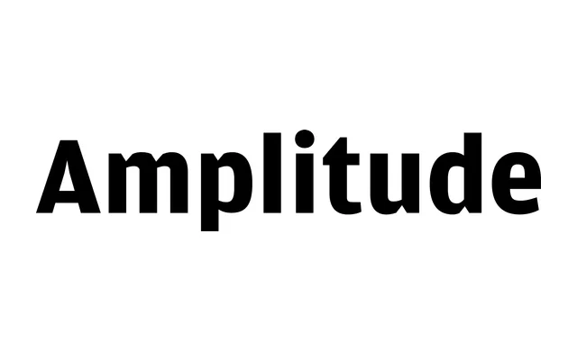
Christian Schwartz's 2003 grotesque, originally from Font Bureau, built on agate type conventions with deep angled ink traps that maintain legibility at small sizes while adding character at display sizes.
About
Amplitude draws on the visual logic of agate type, where angled cuts compensate for ink spread on paper, transforming a purely functional device into a stylistic signature. The family spans five widths from X Compressed to Wide, updated in 2025 with italics for all styles with assistance from Ben Tuttle. Part of the Commercial Type Vault, it sits alongside other Schwartz designs originally published through Font Bureau.
Classification
A sans serif with deep angled ink traps drawn from agate type conventions, giving it a functional grotesque character that reads across both text and display sizes. Its ink-trap cuts are structural rather than decorative, placing it firmly in the grotesque tradition with a utilitarian edge.