 MegaMegaTypeType
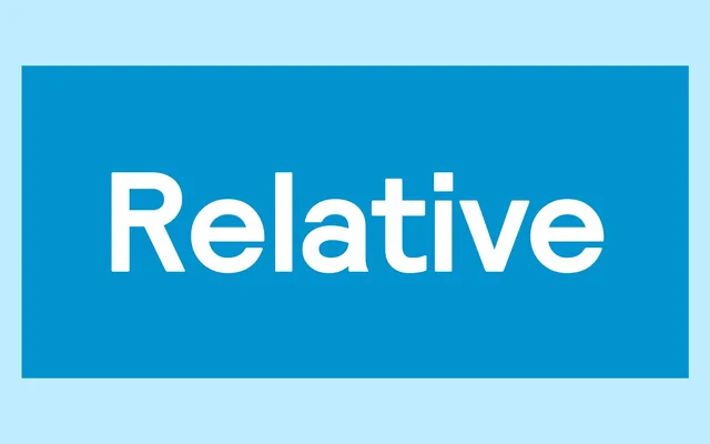
A grotesque family in four weights with italics, extended in the PRO version to Cyrillic and Greek, and distinguished by pitched monospace variants and a faux-monospace cut that subverts fixed-width conventions into deliberate aesthetic choices.
About
Relative splits into two halves: a conventional proportional grotesque running from Book to Black with matching italics, and a range of fixed-width and faux-monospace variants. The faux-monospace cut adopts the spacing discipline of a true monospace typeface while allowing proportional letterspacing, with glyphs such as the 'i' and 'l' shaped to reflect that heritage. The PRO version adds Cyrillic and Greek alongside expanded OpenType features and stylistic alternates.
Classification
A proportional grotesque sans-serif with a distinctive faux-monospace variant; the design straddles conventional proportional spacing and fixed-width aesthetics, placing it firmly in the grotesque tradition with a contemporary technical bent.