 MegaMegaTypeType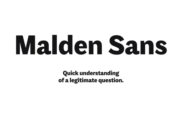
A grotesque by Michele Patanè that keeps the rough edges of 1930s and 1940s film magazines, in normal and condensed widths across 26 styles.
About
Malden Sans began as part of a type system for cinema magazines, and keeps the naive, unrationalised quirks of pre-war editorial type rather than ironing them out. The normal width runs to seven weights and the condensed to six, all with italics. It was built to hold up on cheap paper, and suits posters, packaging and screens as well as editorial work.
Classification
A grotesque with deliberately irregular details taken from 1930s and 1940s film magazine lettering, in Normal and Condensed widths with italics throughout.
Weights
ThinLightRegularMediumBoldExtraBoldBlack
Optical sizes and widths
NormalCondensed
Family
Malden Sans Condensed
Languages
Latin
Tags
grotesqueeditorialcondensedvintagecinemaprintmagazinecharacterful