Richmond Text
Carter & Cone · Matthew Carter, Jill Pichotta, Richard Lipton
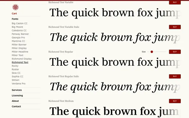
Matthew Carter's newspaper-originated serif, designed for continuous text at all sizes, with sharp serifs, a generous x-height and five weights each with matching italics and variable font support.
About
Originally commissioned for a major British daily newspaper redesign, Richmond Text has since been expanded into a complete family with contributions from Jill Pichotta and Richard Lipton of The Type Founders. The family spans five weights from Regular to Black, each with a matching italic, plus two variable fonts included with the full family purchase. Sharp serifs and a large x-height give it strong presence and sustained legibility across print and screen contexts.
Classification
A sharp-serifed text typeface with a large x-height, originally commissioned for a British newspaper redesign. Its crisp serifs and high x-height place it firmly in the newspaper/editorial serif tradition.