Richmond Display
Carter & Cone · Matthew Carter, Jill Pichotta, Richard Lipton
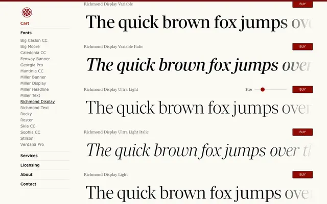
A sharp-serifed display family by Matthew Carter, originally drawn for a major British newspaper redesign and expanded into 14 styles with variable font support.
About
Crisp, high-contrast serifs and a generous x-height give this family its distinctive newspaper-derived character, suited equally to editorial headlines and typographic display work. Seven weights from Ultra Light to Ultra Black are paired with matching italics, and two variable fonts are included with any family purchase. The design was extended from Carter's original commission by Jill Pichotta and Richard Lipton of The Type Founders.
Classification
A sharp-serifed display serif with a large x-height, originally commissioned for a British newspaper redesign. The crisp, high-contrast construction and large x-height place it firmly in the display serif category, optimised for larger settings rather than continuous text.