 MegaMegaTypeType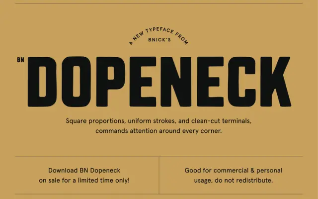
A square-proportioned, heavy display sans drawn from mid-century signage and military stencil lettering.
About
BN Dopeneck uses uniform stroke weight, square proportions and clean-cut terminals to produce a no-frills industrial character. Its references span utilitarian packaging, military stencilling and roadside signage, giving it a blunt, functional authority. It works across headlines, posters, packaging and apparel graphics where raw weight carries the message.
Classification
Chunky, square-proportioned sans with uniform strokes and clean-cut terminals. Inspired by mid-century signage, military stencils and utility packaging.
Languages
Latin
Tags
industrialdisplayboldsignageutilitarian