 MegaMegaTypeType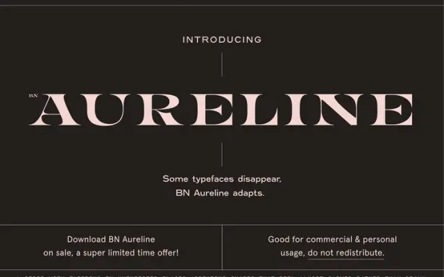
A display serif with deliberately distorted letterforms that stretch, swell and taper to create shapes that feel carved rather than constructed.
About
BN Aureline sits between the familiar and the unexpected, using classical serif foundations as a starting point before introducing deliberate tension through irregular proportions. The letterforms are recognisable enough to read as timeless but strange enough to hold the eye. It is aimed at brand identities that want sophistication without predictability.
Classification
Serif letterforms with sculptural distortion — stretching, pinching and tapering at unexpected points, giving a carved quality. Positioned for identity and branding work.
Languages
Latin
Tags
displayeditorialidentityelegantsculptural