 MegaMegaTypeType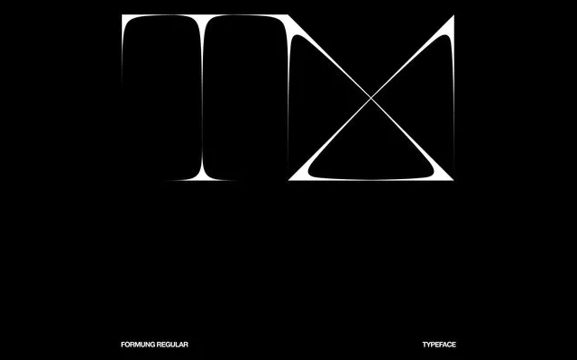
A single-weight experimental display face by Johannes Thiel, built on modular, constructive principles with sharp insets softened by rounded transitions for a futuristic, sculptural effect.
About
Formung is an experimental display typeface from German designer Johannes Thiel. Its letterforms follow constructive, modular logic – sharp geometric insets meet smoothly rounded edges, producing a visual tension that reads as futuristic and almost three-dimensional. With 110 glyphs covering Latin letters, figures, punctuation and symbols, it is strictly a headline and graphic-design tool rather than a workhorse text face.
Classification
Constructive modular letterforms with sharp insets and rounded transitions. Not a conventional serif or sans-serif; sits squarely in the experimental display category with a futuristic, sculptural quality.