 MegaMegaTypeType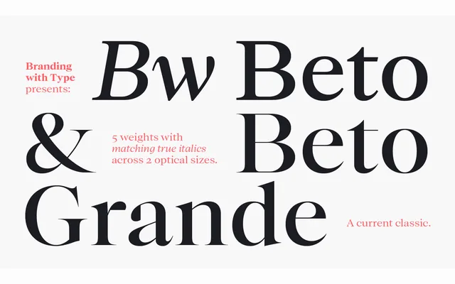
A two-optical-size serif family spanning 300 years of serif tradition, from renaissance roots to transitional contrast, with five weights and matching true italics in each size.
About
Designed by Alberto Romanos, the family offers a text-oriented cut alongside Bw Beto Grande, which increases contrast for display settings while sharing the same metrics and proportions. Five weights with matching true italics in each optical size give 20 styles in total. The design avoids historical dogma in favour of practical branding needs, balancing period references with contemporary function.
Classification
The typeface draws from renaissance and 18th-century transitional serif models, with contrast levels varying between the two optical sizes. The Grande variant pushes contrast further for display use, placing the family firmly in the transitional tradition.