 MegaMegaTypeType
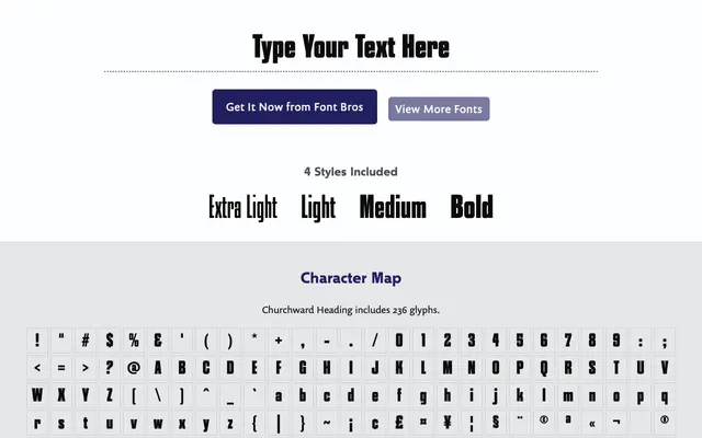
A tightly condensed four-weight display family by Joseph Churchward, notable for its straight-sided round letters, soft corners and elongated terminals.
About
Each weight shares the same narrow proportions, making the family practical when horizontal space is constrained. The round letters are flattened rather than truly circular, giving an architectural, sculpted quality that becomes particularly striking in the Bold weight. Long terminal endings add refinement to what could otherwise be a purely functional condensed design.
Classification
A highly condensed display typeface with straight-sided round letters and soft rounded corners. Its elongated terminals and sculptural quality place it firmly in the display category, designed for impact at large sizes rather than text use.