 MegaMegaTypeType
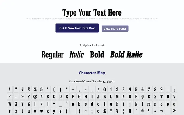
A condensed slab serif from 2005 by Joseph Churchward, featuring subtly concave serifs and idiosyncratic details across two weights with matching italics.
About
Churchward Conserif carries the designer's characteristic flair in its small details: protruding vertical serifs on the cap E, F, L and Z, and a raised terminal on the middle stroke of the lowercase m. The slab serifs are slightly concaved on all sides, softening what might otherwise be a rigid formal texture. Two weights, Regular and Bold, each with a matching italic, cover a broad range of European languages.
Classification
A condensed slab serif with slightly concave serifs on all sides, giving the letterforms a subtly softened geometry. The design sits between text and display use, with distinctive quirks typical of Churchward's output.