 MegaMegaTypeType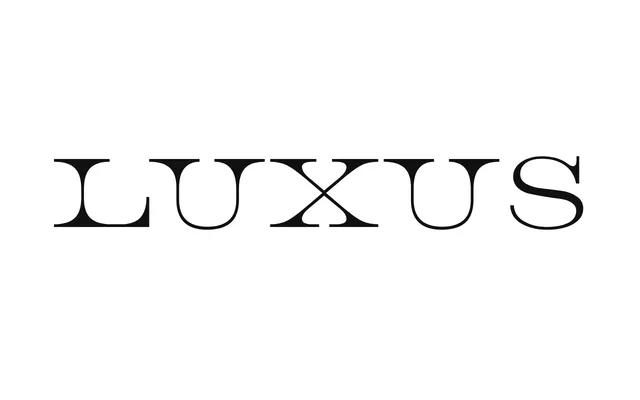
An elegant, strong display face inspired by the extreme serif expansion of Electrolux and Tecno logos.
About
Luxus is inspired by the extreme serif expansion seen in the Electrolux and Tecno logos, described by Atypical as thoroughly designed, elegant and strong. It comes in a contrasted serif cut, Luxus, and a monolinear slab-serif cut, Luxus Not, originally made for backpacker.gr's tenth-anniversary edition.
Classification
A display face inspired by extreme serif expansion in vintage logotypes, offered in a contrasted serif and a monolinear slab cut.
Weights
Regular
Family
Luxus Not
Languages
LatinGreek
Tags
displaylogotypeslabgreekposter