 MegaMegaTypeType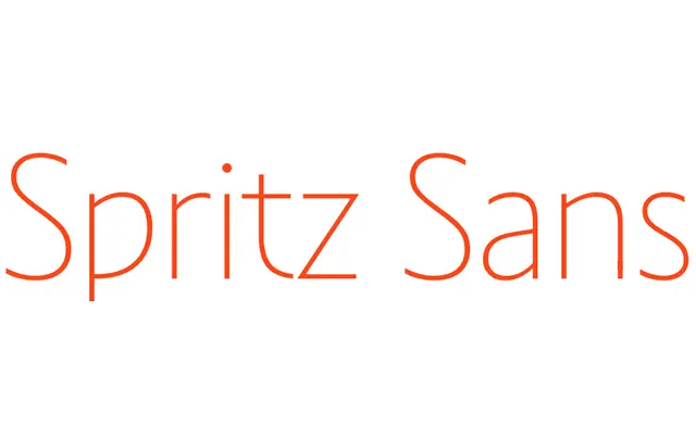
Art Nouveau-inspired variable sans with sharp expressive letterforms sharing a skeleton with its Serif sibling.
About
Spritz Sans is the low-contrast half of a variable type system that shares a structural skeleton with Spritz Serif, bridged by a Serif variable axis. The letterforms are sharp and expressive, drawing on Art Nouveau ornamental traditions while keeping contrast minimal. Best suited to display settings, editorial work and branding in Latin or Cyrillic.
Classification
Low-contrast display sans with sharp, expressive letterforms rooted in Art Nouveau lettering traditions. Part of a variable type system where the Sans and Serif subfamilies share a common structural skeleton, with a Serif variable axis bridging the two voices.
Weights
HairlineThinLightRegularMediumBoldHeavyBlack
Family
Spritz Serif
Languages
LatinCyrillic
Tags
art nouveauvariabledisplayexpressivelow-contrastcyrilliceditorialboutique