 MegaMegaTypeType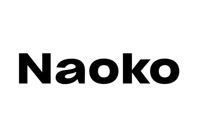
A wide-proportioned sans-serif in seven weights with true italics, designed by Émilie Rigaud and named after Japanese astronaut Naoko Yamazaki.
About
Wide letterforms with very short ascenders and square dots define the roman, while the italics are strongly inclined with deep stem-curve junctions, making them true italics rather than slanted romans. Consistent lightweight diacritics across all seven weights give the family an unusual uniformity, reinforced by three stylistic sets offering alternate letterforms and a lighter punctuation to match. The heavier weights make a bold impression at display sizes, while each cut is refined enough for sustained reading.
Classification
A wide-proportioned sans-serif with generous curves, square dots and true italics with deep junctions, pointing to a humanist influence despite its geometric character. The consistent lightweight diacritics and extended letterforms mark it as an individual interpretation rather than a strict category revival.