 MegaMegaTypeType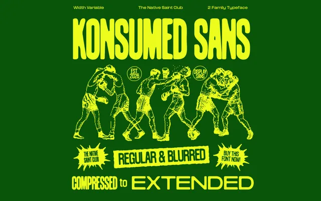
A display sans-serif built across seven widths from compressed to extended, with a matching blurred set for soft-focus typographic effects in high-impact work.
About
Konsumed pairs seven width variants – Compressed through Extended – with matching blurred counterparts, giving designers 14 styles within one coherent system. The blurred subfamily is designed for soft-focus transitions within the same type family, suited to posters, sports graphics and editorial work where type carries visual weight. With 518 glyphs, diacritics and five numeral sets, it has reasonable coverage across Latin extended languages.
Classification
Geometric display sans-serif built around a seven-width axis (Compressed through Extended) with a parallel Blurred set as a second stylistic subfamily. No italic or bold variants. Uppercase and lowercase with diacritics, ligatures and five numeral sets.