 MegaMegaTypeType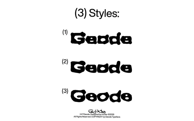
A bold organic display typeface in three styles, moving from rough and detailed to dense and heavy, with letterforms that swell and contract unpredictably to evoke natural rather than drawn forms.
About
HV Geode's three styles – Regular, Smooth and Smoother – share a common structural DNA while varying in surface texture and visual mass, allowing them to work together within a single visual system. Strokes are deliberately uneven, edges ripple rather than resolve cleanly, and the overall silhouette reads closer to something found in nature than constructed on a grid. With 87 glyphs including alternates, it is pitched at poster design, streetwear branding, album artwork and editorial titles.
Classification
A bold display typeface with deliberately irregular, swelling strokes and rippled edges that evoke natural forms rather than geometric construction, placing it firmly in the organic display category.