 MegaMegaTypeType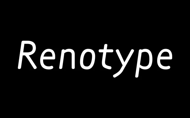
Radim Peško's seven-year exercise in typographic fundamentals, producing a family of five stylistically distinct variants united by a single low-contrast, historically unanchored skeleton.
About
Renotype begins from a question of first principles: what would a Latin archetype look like stripped of epoch-specific references? The result is a family that extends not through weights but through modes of address – Roman and Italic for conventional use, Mono for standardised applications, Quasitalic for something more playful, and Medieval for speculative territory. Each style shares the same underlying construction while pointing in a markedly different direction.
Classification
A low-contrast, proportionally grounded typeface without strong historical or tool-based reference points. Its archetype-like neutrality places it in the humanist sans tradition, though its Medieval variant introduces blackletter-inflected forms.