 MegaMegaTypeType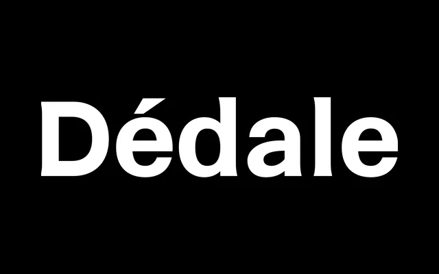
Originally created for the visual identity of the Paris Catacombs, this 2020 variable family by Thomas Bouville moves across three structurally linked styles – slab serif, incised and neo-grotesque – to evoke the erosion of letterforms over time.
About
Each of the three static styles occupies a different typographic register: the Light is a refined slab serif suited to large titles, the Regular an incised text face with prominent stroke endings, and the Bold a neo-grotesque retaining traces of the incised form. The variable font allows continuous interpolation between all three, making the transition between styles – and the metaphor of time passing – directly navigable. The shared skeletal structure across styles draws an analogy between the letter and the human body, moving from life towards death as the design thickens and loses its serifs.
Classification
Dédale spans three structurally related but stylistically distinct styles across a single variable axis: a slab serif (Light), an incised/lapidary serif (Regular) and a neo-grotesque sans (Bold), making it a rare hybrid family where the category shifts across weights.