 MegaMegaTypeType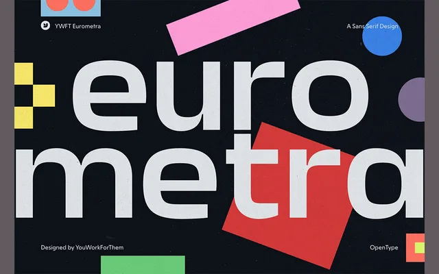
A five-weight geometric grotesque drawing on mid-century European poster design, with a characterful uppercase G and increasingly pronounced cuts through the heavier weights.
About
YWFT Eurometra takes cues from Dutch and broader European graphic design of the 1950s to 1970s, positioning itself as a sharper, more personality-driven alternative to neutral grotesques. The lighter weights offer a softer tone suitable for body text, while the black weight pushes into bold, retro-inflected headline territory. Stylistic alternates, ligatures and extended stylistic sets extend its usefulness across editorial and branding contexts.
Classification
A geometric sans-serif with grotesque influence, leaning on mid-century European modernist traditions. Its sharp cuts, geometric lowercase forms and characterful uppercase G place it firmly in the geometric grotesque category.