 MegaMegaTypeType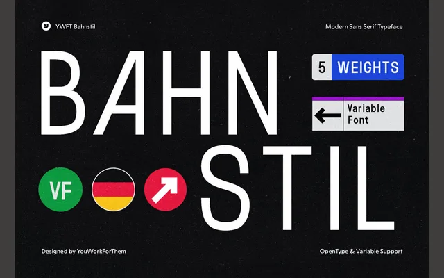
A DIN-inspired sans-serif in five weights and a variable option, softening the mechanical rigour of mid-20th century German industrial lettering with subtle humanistic curves.
About
Drawing from DIN 1451 Engschrift, Breitschrift and Mittelschrift, YWFT Bahnstil revisits the logic of German industrial type with deliberate organic touches that temper its near-monospaced structure. Five weights from Extra Light to Extra Bold are accompanied by a variable font option, and over 400 glyphs per weight cover a broad range of Latin languages. It is aimed at UI, digital advertising and corporate identity work where DIN conventions are expected but strict uniformity is not.
Classification
A DIN-inspired geometric sans with near-monospaced proportions, drawing from DIN 1451 Engschrift, Breitschrift and Mittelschrift. Humanistic curves and slight irregularities soften the mechanical rigidity typical of industrial DIN lettering.