Sucrose
Yellow Design Studio · Ryan Martinson
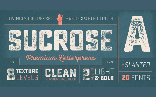
A 20-font letterpress display family built around eight levels of distress texture, allowing designers to mix styles for convincingly aged typesettings.
About
Sucrose pairs rectangular letterforms with authentic-looking letterpress texture across two weights, regular and bold, each available in four distress levels and a slanted variant. The numbering system (One through Four) controls the degree of ink spread and wear, enabling natural-looking variation within a single composition. Both the upright and slanted subfamilies share the same distress logic, giving the 20-style family a consistent underlying structure.
Classification
Rectangular letterforms with hand-crafted distress texture simulate authentic letterpress printing. The family is built around varying levels of ink trap and distress rather than conventional optical sizes, placing it firmly in the display category.