Setra Top
We Love Fonts · Olli Meier · 2026
displayexperimental display grotesque
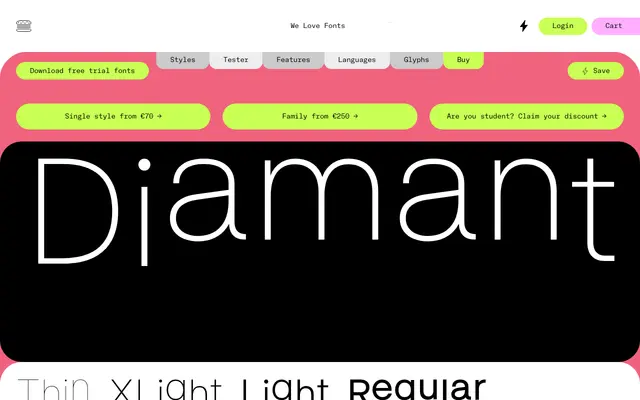
An experimental display grotesque that reworks Setra's structure for expressive headline use.
About
Setra Top takes the low-contrast grotesque foundation of Setra and pushes it in a more expressive, display-oriented direction. The experimental tag from the foundry signals letterform modifications that distinguish it from the neutral base. Ten weights plus a variable file are included in the family, covering everything from spare hairlines to heavy impact.
Classification
A display-optimised variant of the Setra grotesque, explicitly tagged Display and Experimental by the foundry. It retains low contrast and the grotesque skeleton of the base Setra but introduces modifications intended to read with more character at headline scale.
Weights
ThinXLightLightRegularMediumSemiBoldBoldXBoldBlackXBlack
Languages
Latin
Tags
grotesquedisplayexperimentalvariablelow-contrastheadlinebig-x-height