Setra
We Love Fonts · Olli Meier · 2026
sans-serifneutral grotesque
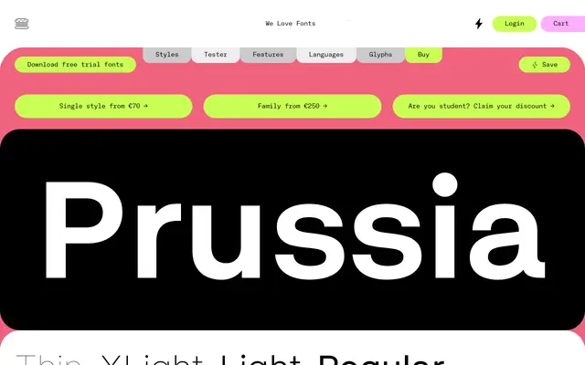
A neutral, low-contrast grotesque with a large x-height and ten static weights.
About
Setra is a workhorse neutral grotesque built around a generous x-height and minimal stroke contrast. The weight range runs from Thin to XBlack across ten named styles, with a variable font file included in the family purchase. Extensive Latin-script language support makes it viable for multilingual publishing and interface work.
Classification
Low-contrast, neutral grotesque with a large x-height. The foundry tags it Sans, Grotesque, Neutral and Low Contrast, placing it in the utilitarian grotesque tradition alongside faces like Helvetica Neue or Aktiv Grotesk, though with a markedly wide weight range and broad multilingual coverage.
Weights
ThinXLightLightRegularMediumSemiBoldBoldXBoldBlackXBlack
Languages
Latin
Tags
grotesqueneutralvariablelow-contrastworkhorsemultilingualbig-x-height