Calafati
Wannatype · Ekke Wolf
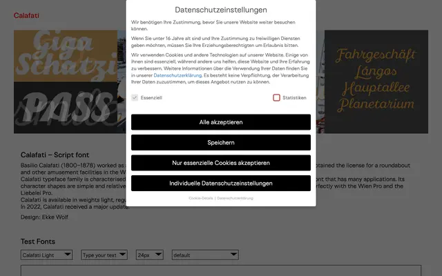
Named after the Viennese Prater showman Basilio Calafati, this five-weight sans is built on strong horizontals and low contrast for broad typographic utility.
About
Calafati's simple, unembellished letterforms and emphasis on horizontal stroke rhythm give it a steady, unpretentious character suited to a wide range of applications. Five weights run from Light to Black, with extensive Latin language coverage spanning well over a hundred scripts. The family received a significant update in 2022 and is designed to pair with Wannatype's Wien Pro and Liebelei Pro.
Classification
Low stroke contrast with strong horizontal emphasis and simple, relatively unembellished letterforms place this firmly in the sans-serif category. Its understated construction and functional character suggest a humanist sans sensibility despite the page's 'script font' label.