 MegaMegaTypeType
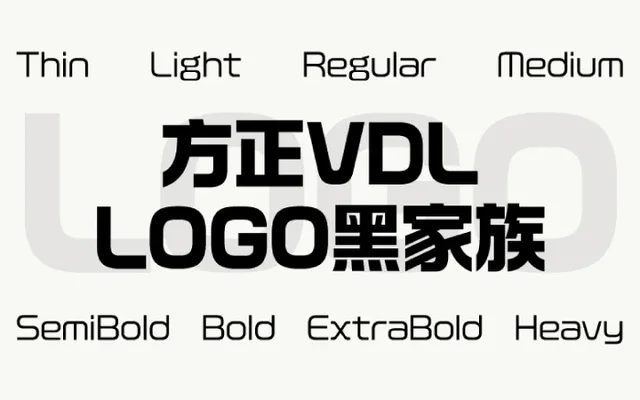
VDL's Logo G in Simplified Chinese, a squared-off gothic made so that any setting looks like a logotype.
About
Logo Hei carries VDL's Logo G into Simplified Chinese. Stroke ends are cut flat and square, and each character is balanced to the same density, so words hold together whether set across or down the page. Eight weights from Thin to Heavy make it a practical branding and headline face.
Classification
A Simplified Chinese design gothic based on VDL's Logo G. Stroke ends are squared to the horizontal and vertical and every character carries the same visual weight.
Weights
ThinLightRegularMediumSemiBoldBoldExtraBoldHeavy
Family
方正VDL LOGO黑
Languages
Simplified Chinese
Tags
cjkchinesesimplified-chinesegothicheisans-seriflogogeometricdisplay