UT Wismenta
Universitype · 2025
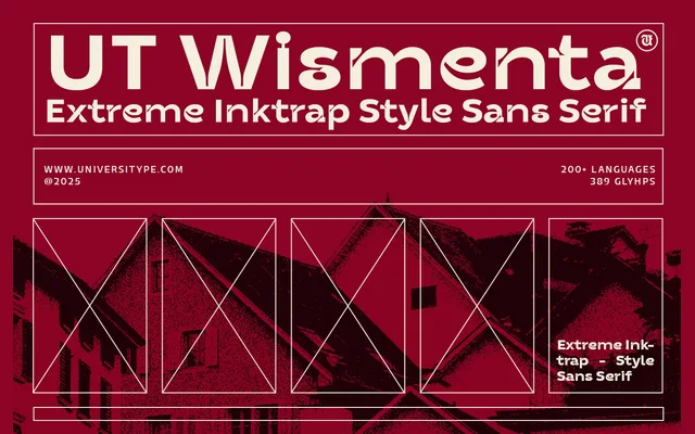
A single-weight bold display sans-serif that grafts extreme ink traps onto a grid-based geometric structure for an intentionally brutal effect.
About
UT Wismenta takes the ordered logic of Swiss modernist design as its starting point, then disrupts it with aggressive ink traps that give the letterforms an expressive, almost fractured quality. Available in one weight only, it is unambiguously a headline face built for impact rather than sustained reading. Distributed in OTF, TTF and WOFF formats.
Classification
A bold display sans-serif built on grid-based geometric principles but distinguished by extreme ink traps that give it an expressive, brutalist character. The single-weight design is clearly intended for large-scale display use rather than text setting.