 MegaMegaTypeType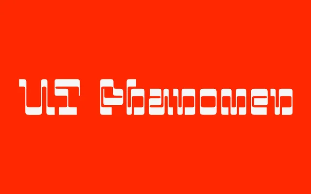
A display face with horizontal contrast drawn from MICR E-13B banking typography and postdigital aesthetics.
About
UT Phänomen inverts the conventional stress axis: horizontals are heavy where verticals are light, taking direct cues from MICR E-13B, the magnetic ink character recognition font used on bank cheques. The result is an industrial, technically-inflected display typeface that sits within the reverse-contrast lettering tradition. It suits editorial and brand contexts where a postdigital, machine-influenced aesthetic is the point.
Classification
Features horizontal contrast — thicker horizontals than verticals — directly inverting the conventional stress axis of traditional type. Influenced by MICR E-13B banking typography, placing it in the tradition of reverse-contrast and industrial display lettering with a postdigital theoretical framing.