Vidocq
Typogama · Michael Parson · 2019
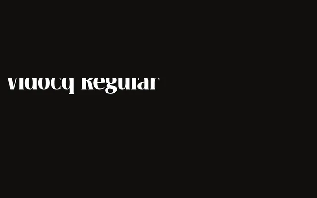
A single-weight display typeface by Michael Parson, taking its cues from 19th-century woodcut lettering with rounded, dark-stroked forms in a narrow proportion suited to headlines and titles.
About
Designed in 2019, Vidocq combines the sturdy, rounded forms of woodcut tradition with a narrow set width that handles condensed headline settings well. Its bold weight carries a friendliness that softens the darkness of its strokes, making it workable across a range of editorial and branding contexts. An extended character set and OpenType features including arrows and fleurons give designers additional compositional tools beyond the core alphabet.
Classification
A single-weight display typeface drawing on 19th-century woodcut letterpress traditions, with rounded forms, dark strokes and narrow proportions. Its bold, decorative character places it firmly in the display category.