Ultion
Typogama · Michael Parson · 2025
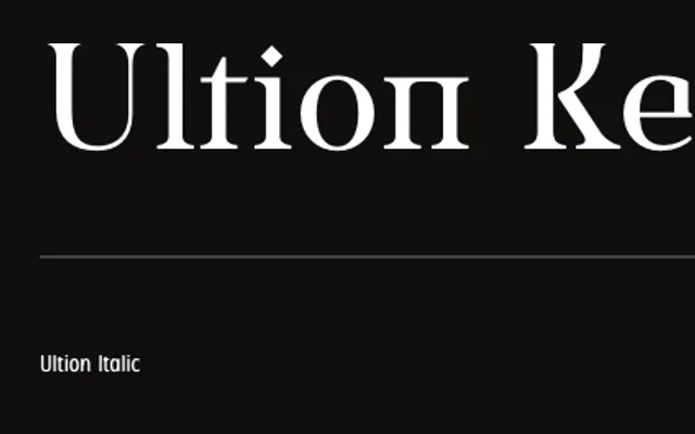
A transitional serif by Michael Parson that introduces letterform details drawn from Cyrillic to reinforce horizontal tension, offered in both high-contrast display and reduced-contrast text subfamilies.
About
Ultion spans five weights with italics in two optical subfamilies: the standard cut favours high contrast suited to headlines, while the Text subfamily moderates stroke contrast for sustained reading. The family is available as static OTF or variable TTF files with weight and contrast axes, supported by OpenType features including ligatures and multiple numeral sets. Extended Latin coverage reaches over 250 languages and dialects across ISO Latin 1 through 4.
Classification
Rooted in 17th-century transitional serif conventions, Ultion applies high stroke contrast and strong horizontal tension drawn partly from Cyrillic letterform traditions. A secondary Text subfamily reduces contrast for a more balanced, text-oriented solution.