Scootchy
Typogama · Michael Parson · 2021
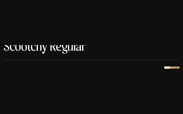
A narrow, high-contrast sans-serif in four weights with italics, designed by Michael Parson for use across both display and text settings.
About
Released in October 2021, Scootchy pairs an industrial structure with humanist details across four weights from Regular to Black, each with a matching italic. Its narrow proportions and pronounced stroke contrast make it particularly suited to editorial and display work, while the extended Latin character set and variable font format add practical range. OpenType features broaden its typographic utility across a wide variety of layouts.
Classification
A high-contrast, narrow sans-serif that blends industrial and humanist influences. The combination of tight proportions, significant stroke contrast and four weights from Regular to Black positions it firmly within the humanist sans tradition with display characteristics.