Rosengarten
Typogama · Michael Parson · 2016
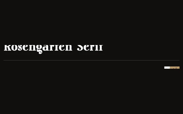
A condensed bold display serif by Michael Parson, drawing on Lucien Bernhard's Plakatstil tradition with rounded serifs and a companion sans subfamily, released in 2016.
About
Designed for headlines and large point sizes, the serif cut features bold rounded serifs and tight condensed proportions rooted in early twentieth-century German poster lettering. A complementary sans serif style with matching italics extends its utility in mixed-style layouts. Extended Latin and Cyrillic language support broadens its application across European markets.
Classification
A condensed, bold display serif inspired by Lucien Bernhard and the Plakatstil poster tradition, with rounded slab-like serifs designed for headline use. The accompanying sans is a complementary secondary style rather than a separate family.