Nedo
Typogama · Michael Parson · 2011
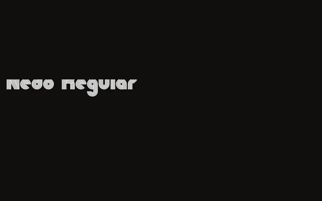
A single-weight display face by Michael Parson built from pure geometric lines, distinguished by an extensive set of ligatures and alternate characters.
About
Released in January 2011, Nedo uses a strict system of geometric lines as its structural basis, giving the letterforms a constructed, technical character suited to headline and display use. The ligature set is notably large, offering typographic variety within the constraints of a single weight. ISO Latin-1 language support covers a broad range of Western European languages.
Classification
A single-weight display face constructed entirely from geometric lines, placing it firmly in the display category. Its strict geometric construction and decorative ligature set distinguish it from functional geometric sans families.