Kurstiva
Typogama · Michael Parson · 2017
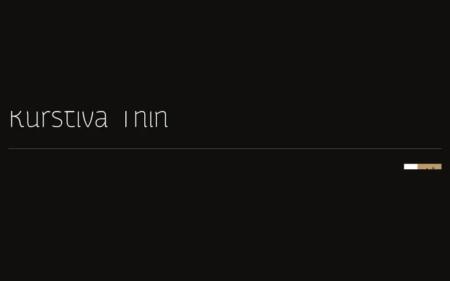
A narrow ten-weight sans-serif designed by Michael Parson in 2017, built for text use at small sizes while revealing finer details at display scale.
About
Released in five weights with matching italics, Kurstiva spans from hairline Thin to Black across a compact, narrow footprint suited to dense typesetting. The extended character set covers most Latin-based languages, a broad range of monetary symbols and a complete arrow collection. Functionality is its priority, though the design shows enough personality to serve headline and logotype work.
Classification
A narrow sans-serif with no visible serif structures and consistent stroke weight, placing it in the grotesque tradition. Its condensed proportions and contemporary construction distinguish it from geometric or humanist models.