Bauhau
Typogama · Michael Parson · 2008
sans-serifgeometric sansitalic
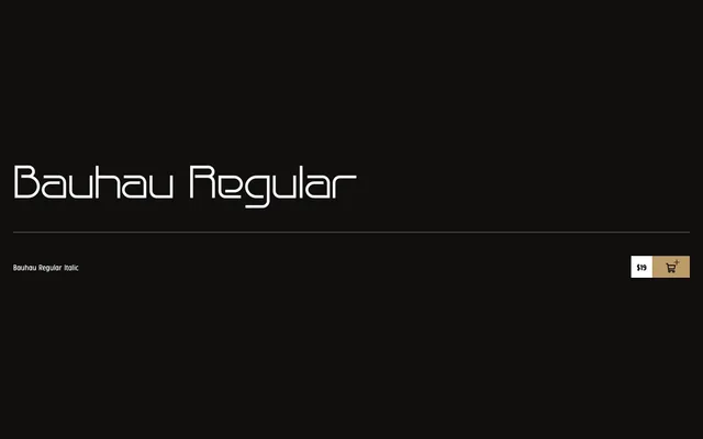
A wide, minimalist geometric sans-serif by Michael Parson, released in 2008, drawing on Bauhaus formal principles with open shapes and three weights.
About
Released in January 2008, Bauhau takes its cues from Bauhaus design philosophy, favouring wide proportions, open counters and restrained stroke contrast. The family covers three weights – Light, Regular and Bold – each with a matching italic, and supports ISO Latin-1 across a broad range of European languages. Its generous width makes it well suited to display and headline use.
Classification
Wide, open geometric sans-serif inspired by Bauhaus minimalism, with uniform stroke widths and clean letterforms characteristic of the geometric grotesque tradition.
Weights
LightRegularBold
Languages
AfrikaansAlbanianBasqueBretonCatalanDanishEnglishFaroeseGalicianGermanIcelandicIrishItalianKurdishLatinLeoneseLuxembourgishNorwegianOccitanPortugueseRhaeto-RomanicScottish GaelicSpanishSwahiliSwedishWalloon
Tags
geometricbauhausminimalistwidedisplaycleanmodernist