Parisine
Typofonderie · Jean François Porchez · 1996
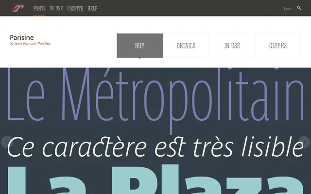
The humanist sans designed for Paris Metro signage, now one of the city's visual symbols alongside Johnston in London and Helvetica in New York.
About
Parisine started in 1996 as a custom Bold and Bold Italic for RATP, based on Helvetica Bold's proportions but condensed to 90 percent with softer, rounder counters to keep it legible at small sizes. It grew into a full family by 1999, with Narrow, Compress, Office and Plus versions extending it for maps and general communication.
Classification
A humanist sans built on Helvetica Bold's proportions but condensed to 90 percent and opened up for legibility, designed for RATP Paris Metro signage in 1996 and later extended into Narrow, Compress, Office and Plus sub-releases for wider communication use.