Costa
Typofonderie · Jean François Porchez · 2004
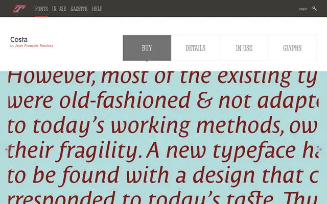
A Mediterranean-style sans with a brush-like ending serif on select lowercase letters, born as a bespoke face for an Italian cruise line.
About
Costa mixes the purity of Greek capitals with the softness of Renaissance script, giving its capitals a clean sans-serif structure while several lowercase letters, the a, n and d among them, pick up a small brush-stroke serif. It started in 1999 as a bespoke typeface for Costa Crociere before Typofonderie released it generally in 2004.
Classification
A sans-serif with a twist: capitals stay close to pure sans models while several lowercase letters carry a small ending serif, a soft brush effect rather than a true serif. Began as a bespoke 1999 design for Costa Crociere before its 2004 general release.