Audace
Typofonderie · Jean François Porchez · 2019
sans-serifgeometric display sans, organic and nature-inspireditalic
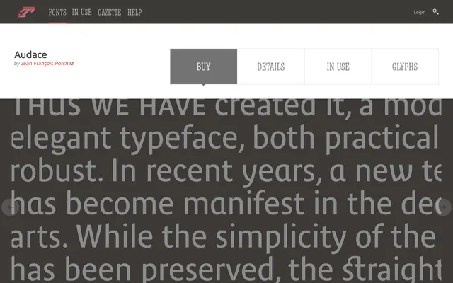
A display sans that sits between geometric construction and shapes borrowed from nature.
About
Audace is built for headline presence rather than text, with a design brief the foundry describes as living between geometry and natural form. Regular through Extra Bold, with italic, cover its range.
Classification
A display sans positioned by the foundry between geometry and shapes inspired by nature, in five styles.
Weights
RegularDemiBoldExtra Bold
Languages
Latin
Tags
geometricorganicsans-serifdisplayheadline