Ardoise
Typofonderie · Jean François Porchez · 2010
sans-serifhumanist sans, Antique Olive homagecondenseditalic
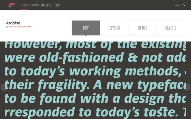
A humanist sans paying homage to Roger Excoffon's Antique Olive, built for newspaper work in four widths.
About
Ardoise grew out of Charente, a 1999 Porchez design later reworked in 2010 for the French magazine Pèlerin. It shares Antique Olive's warmth and open counters, and comes in standard, Narrow, Tight and Compact widths to handle everything from body text to tight headline settings.
Classification
An homage to Roger Excoffon's Antique Olive, evolved from Porchez's earlier 1999 design Charente and revamped for the redesign of Pèlerin magazine. Sold in standard, Narrow, Tight and Compact widths.
Weights
ThinExtra LightLightRegularDemiBoldExtra BoldHeavyBlack
Optical sizes and widths
standardNarrowTightCompact
Family
Ardoise NarrowArdoise TightArdoise Compact
Languages
Latin
Tags
humanistsans-serifnewspapercondensedfrench