Ambroise
Typofonderie · Jean François Porchez · 2016
serifDidot-style display serifcondenseditalic
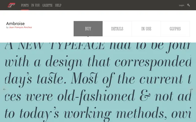
A Didot-style display serif named for the Didot printing dynasty, with condensed and extra-condensed widths built in.
About
Ambroise takes high-contrast Didot forms and gives them a full width range: standard, the condensed Firmin, and the extra-condensed François. Seven weights with italics cover the family, all tracing their names to members of the historic Didot printing house.
Classification
Every cut in the family is named after a member of the Didot printing dynasty. Ambroise Firmin is the condensed width and Ambroise François the extra-condensed width of this same design, not separate typefaces.
Weights
LightRegularDemiBoldExtra BoldHeavyBlack
Optical sizes and widths
standardcondensedextra-condensed
Family
Ambroise FirminAmbroise François
Languages
Latin
Tags
didotdisplaycondensededitorialfrench