 MegaMegaTypeType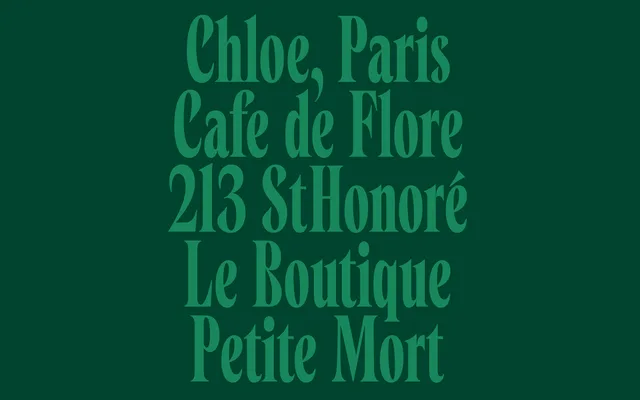
An eighteen-style Art Nouveau serif across three widths, with elegant curves and graceful contrast drawn from early twentieth-century book covers.
About
Cleric takes its expressive curves and sense of movement from lettering found on early twentieth-century book covers, carrying real Art Nouveau spirit. Three widths, Condensed, Normal and Wide, each in six styles with a variable font, give it useful range for packaging, fashion and editorial design. Detailed letterforms and a flowing rhythm keep it warm without losing sophistication.
Classification
An Art Nouveau-influenced serif drawing on early twentieth-century book cover lettering, spanning three widths (Condensed, Normal, Wide) each with a full weight range and variable font.
Weights
RegularMediumSemiBoldBoldExtraBoldHeavy
Optical sizes and widths
CondensedNormalWide
Family
Cleric CondensedCleric NormalCleric Wide
Languages
Latin Extended
Tags
serifart-nouveaucondensedpackagingfashioneditorialvariable