 MegaMegaTypeType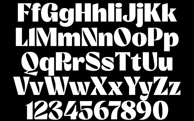
A nine-weight display face channelling 1970s graphic design, packed with opentype icons and special glyphs for packaging and big display work.
About
Brule is a tribute to 1970s graphic design, built as a juicy, iconic display face rather than a neutral text style. It ships packed with OpenType features, icons and special glyphs, adding excitement to packaging and large-format visual communication. Nine weights and a variable font in the full family pack give it flexibility across the range.
Classification
A juicy, iconic display face tied explicitly to 1970s graphic design, packed with icons and special glyphs rather than following a strict serif or sans structure.
Weights
LightTextNormalRegularMediumSemiBoldBoldExtraBoldHeavy
Languages
Latin Extended
Tags
displayseventiespackagingbrandingvariableicons