LaFarge
Typetanic · 2020
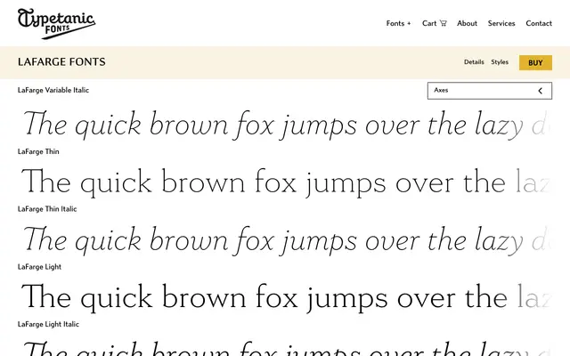
A serif typeface whose capitals are drawn from the handmade mosaic tile lettering of early-20th century New York City Subway stations, with a complementary lowercase rooted in Della Robbia, Windsor and Cheltenham.
About
Named after Christopher Grant LaFarge, one of the original subway architects, the family spans seven weights with matching italics and two variable fonts, covering both display and text use. The capitals faithfully recreate the modular, industrial character of historic station signage, while the lowercase brings legibility across body-copy settings. It has won the 2021 Communication Arts Award of Excellence and an ADC Annual Merit award, and is suited to architectural restoration work where period authenticity is required.
Classification
A humanist serif drawing on late-19th and early 20th-century models such as Della Robbia, Windsor and Cheltenham, with capitals derived from handmade mosaic tile letterforms found in early New York City Subway stations. The combination of modular, architecturally inspired caps and an evenly readable lowercase places it firmly in the humanist serif tradition.