Gibbs
Typetanic · 2015
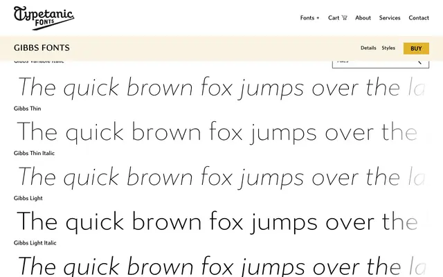
A humanist sans commissioned for the SS United States Conservancy, with capitals derived from the ship's original mid-century cast aluminium signage, spanning six weights with italics and variable font support.
About
Designed for the non-profit steward of the historic SS United States ocean liner, Gibbs takes its name from the ship's designer William Francis Gibbs. The distinctive uppercase letterforms were drawn directly from the vessel's mid-century cast aluminium signs, landing somewhere between American industrial lettering and the English humanist tradition of Gill and Johnston. The family runs from Thin to Black across 12 styles, including two variable fonts, and received a Type Directors Club Certificate for Typographic Excellence in 2015.
Classification
Sits between industrial American vernacular lettering and English humanist traditions in the vein of Gill and Johnston, with distinctive mid-century capitals drawn from cast aluminium shipboard signage. The humanist proportions and quirky uppercase details place it firmly in the humanist sans subcategory.