 MegaMegaTypeType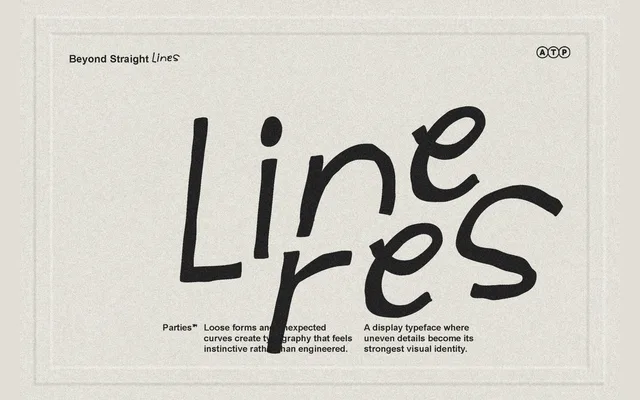
A three-weight handwritten display font from Typeparties built around deliberately uneven strokes and naturally flowing letterforms.
About
Lineres leans into organic imperfection, with uneven curves and irregular strokes that give the family a loose, hand-drawn character. Three weights – Light, Regular and Bold – provide some range for display and editorial use. It is best suited to poster work, packaging and social media contexts where a casual, personal tone is needed.
Classification
A handwritten display script with organic, imperfect letterforms and naturally flowing strokes, placing it firmly in the casual script/display category rather than a formal calligraphic tradition.
Weights
LightRegularBold
Languages
Latin
Tags
handwrittendisplayscriptorganiccasualimperfectplayfulposter