Museu de Arte da Pampulha
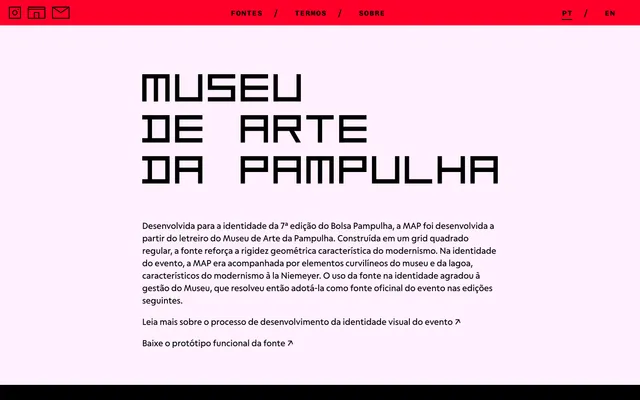
A geometric display typeface drawn from the signage lettering of the Museu de Arte da Pampulha in Belo Horizonte, built on a strict square grid across 10 weights.
About
Developed originally for the visual identity of the 7th Bolsa Pampulha arts grant, the design lifts its letterforms directly from the museum's existing signage, reinterpreting them as a formal typeface. The square grid construction enforces a rigid modularity that references Brazilian modernism, complementing the curvilinear architectural language of Oscar Niemeyer's building. The museum subsequently adopted it as the official typeface for the event in subsequent editions, covering 197 glyphs and the principal Romance languages.
Classification
Constructed on a regular square grid with monotone stroke contrast, the typeface is a rigid geometric sans-serif with a blocky, modular character derived directly from signage lettering. Its strict geometry and linear construction place it firmly in the geometric display category.