 MegaMegaTypeType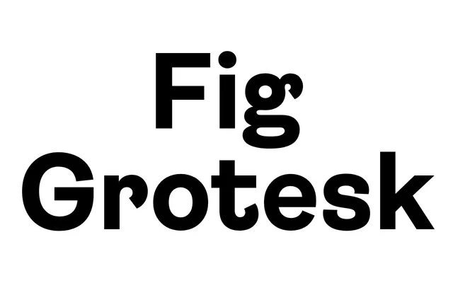
A friendly grotesque sans in eight weights, its curvy terminals borrowed from a 19th-century Amsterdam type specimen.
About
Fig Grotesk takes a curvy terminal detail from a late-19th-century Amsterdam Type Foundry specimen and rebuilds it in a geometric structure, giving an otherwise contemporary grotesque a warmer, more playful edge. Eight weights from Thin to Black run with italics, for 16 styles in total. Suited to logos, headlines and subheads where a grotesque needs a bit more personality.
Classification
Modern grotesque proportions with softened, curvy terminals place Fig Grotesk in the grotesque subcategory with a warmer than usual tone.
Weights
ThinLightBookRegularMediumSemiboldBoldBlack
Languages
Latin Extended
Tags
grotesquefriendlylogosheadlinesbranding