 MegaMegaTypeType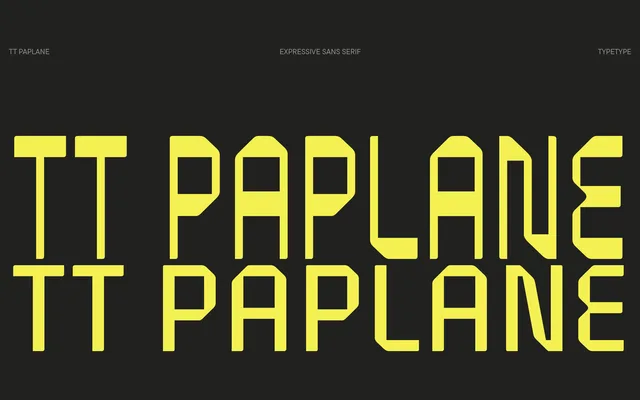
A squared display sans built around the visual logic of a folded paper plane, with 45-degree cuts, asymmetrical stroke endings and a reverse-contrast Thin style that reads like a barcode.
About
Released in 2024, TT Paplane draws its letterform logic from the image of a paper strip folded into a plane: strokes are squared, terminals are cut at 45 degrees and outer contours flow in a way that suggests creased ribbon. The family offers two contrasting statics styles – a low-contrast Regular and a reverse-contrast Thin – plus a variable font with a weight axis, and covers 230+ languages across Latin and Cyrillic scripts. Uppercase characters are noticeably narrower than lowercase, nudging the proportions towards monospaced territory and reinforcing the nostalgic, 80s-to-90s mood.
Classification
A squared, modular display sans built around the visual metaphor of folded paper, with 45-degree cuts and asymmetrical stroke endings. The reverse-contrast Thin style and near-monospaced proportions push it firmly into the display category rather than functional text.