 MegaMegaTypeType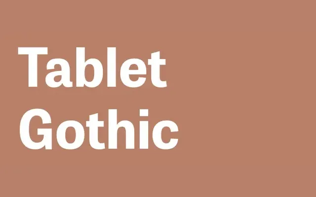
A grotesque sans-serif family by Veronika Burian and José Scaglione spanning six widths and seven weights, with variable font support across 84 static styles.
About
Designed for editorial and publication environments where dense information demands both flexibility and visual coherence, Tablet Gothic maintains a sturdy, clean grotesque character across its full range. Six widths from Compressed to Wide, each in seven weights with obliques, make it exceptionally adaptable across print and digital contexts. Variable font versions for both upright and oblique axes allow continuous access to the full design space.
Classification
A grotesque sans-serif with a range of widths from Compressed to Wide, maintaining the clean, upright character typical of the genre. The oblique rather than true italic confirms its grotesque lineage.